Talk:Characters: Difference between revisions
(→Refactoring: move witch table to the main article page) |
Homerun-chan (talk | contribs) |
||
| Line 27: | Line 27: | ||
:What do you think if we use 7 cards per row? I think it looks cleaner this way (and looks less important than the main character section). --[[User:0x99|0x99]] 16:42, 19 March 2011 (UTC) | :What do you think if we use 7 cards per row? I think it looks cleaner this way (and looks less important than the main character section). --[[User:0x99|0x99]] 16:42, 19 March 2011 (UTC) | ||
::Looks good to me. [[User:Prima|Prima]] 16:52, 19 March 2011 (UTC) | ::Looks good to me. [[User:Prima|Prima]] 16:52, 19 March 2011 (UTC) | ||
Overall it looks good, but | |||
* I would split "Main characters" and "supporting characters" in two different tables. It looks a bit messy now. (maybe make the supporting character's cells a bit bigger in height too?) | |||
* The fact that some names (the long one: Kriemhild Gretchen and the familiars that share one cell) have a smaller font than others bugs me. On the other hand, that gave me an idea: make the familiars appear slightly smaller than the witches they belong to (but all witches would have the same font size). --[[User:Homerun-chan|Homerun-chan]] 17:02, 19 March 2011 (UTC) | |||
Revision as of 17:02, 19 March 2011
Walpurgis Night
Walpurgis Night has been confirmed to be a witch on the official website. Hence, I added a link to the speculah article here. When more info on the witch is gathered, I think we should make a separate page for the witch herself. --Homerun-chan 18:18, 9 March 2011 (UTC)
Refactoring
I like that new design. We should apply it to the witches section too. The problem is that using the cards as images renders pretty meh (see below -- the biggest problem is that we lack a lot of cards). Any idea? --Homerun-chan 16:42, 17 March 2011 (UTC)
Snip: see also witch table on the article page
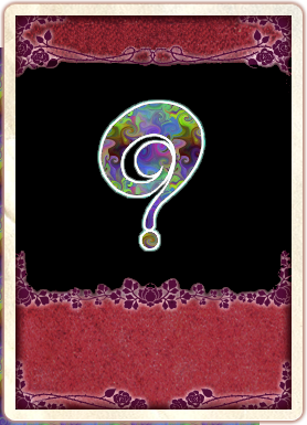
I like it, but the lines between cards and links should be removed. We could use normal screenshots for the missing pictures or a ? pic like Suleika if the character did not appear in the series. On a related note, the parts about the witch in the Sayaka article should be moved to the Oktavia article. -- Anon-kun 18:39, 17 March 2011 (UTC)
- I agree with Anon-kun about the lines. I think a ? pic would be better than a screenshot. And can someone take a look at the speculah on Gertrud I added (under talk)? --Cleo 21:01, 17 March 2011 (UTC)
- How about a strong line like this? (See above) --0x99 06:03, 18 March 2011 (UTC)
- I'm not sure about the strong line. I think it catches too much attention. Maybe keep the normal line between the card and the names, but remove it between the witche's name and its familiars? --Homerun-chan 11:31, 18 March 2011 (UTC)
- I tried doing what you suggested, but it looks weird because padding in the top cell and bottom cell are merged together; what do you think if I changed the strong line to a simple space like this? --0x99 15:27, 18 March 2011 (UTC)
- I'm not sure about the strong line. I think it catches too much attention. Maybe keep the normal line between the card and the names, but remove it between the witche's name and its familiars? --Homerun-chan 11:31, 18 March 2011 (UTC)
- Here's a blanked card Prima 06:22, 18 March 2011 (UTC)
- Tried adding the blank card. Generally speaking, it looks good IMO, but maybe we should change the question mark's style a bit, it look too much like Suleika's card right now (well... It is Suleika's card after all) --Homerun-chan 11:31, 18 March 2011 (UTC)
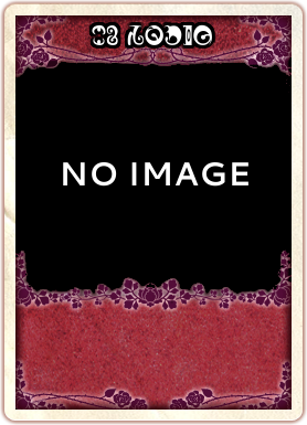
- Here's something different. It's not polished at all (especially the runetext at the top which looks funny for now) but that shows another concept --Homerun-chan 11:41, 18 March 2011 (UTC)
- Cleaned a little, changed the texture to give it a slightly different look. Revert it to version two if it's unsightly. Prima 11:51, 18 March 2011 (UTC)
- I think this card works. --0x99 16:34, 19 March 2011 (UTC)
- Tried adding the blank card. Generally speaking, it looks good IMO, but maybe we should change the question mark's style a bit, it look too much like Suleika's card right now (well... It is Suleika's card after all) --Homerun-chan 11:31, 18 March 2011 (UTC)
- What do you think if we use 7 cards per row? I think it looks cleaner this way (and looks less important than the main character section). --0x99 16:42, 19 March 2011 (UTC)
- Looks good to me. Prima 16:52, 19 March 2011 (UTC)
Overall it looks good, but
- I would split "Main characters" and "supporting characters" in two different tables. It looks a bit messy now. (maybe make the supporting character's cells a bit bigger in height too?)
- The fact that some names (the long one: Kriemhild Gretchen and the familiars that share one cell) have a smaller font than others bugs me. On the other hand, that gave me an idea: make the familiars appear slightly smaller than the witches they belong to (but all witches would have the same font size). --Homerun-chan 17:02, 19 March 2011 (UTC)

