Handwritten runes: Difference between revisions
Jump to navigation
Jump to search
m (actually, never use L1 headings (= blahblahblah =) on MediaWiki) |
No edit summary |
||
| (11 intermediate revisions by 6 users not shown) | |||
| Line 15: | Line 15: | ||
* Cursive style | * Cursive style | ||
* Best C-character for handwriting ♥ | * Best C-character for handwriting ♥ | ||
{{-}} | {{-}} | ||
=== 2ch Variant === | |||
[[File:2ch handwritten runes writing sample.jpg|thumb|2ch Variant writing sample: <br /> {{runes|KARAAGE OISHIKU TSUKURUNARA?}} KARAAGE OISHIKU TSUKURUNARA?]] | |||
2ch begun experimenting with handwritten runes after [[The Rebellion Story]] premiere. Despite the late start, their script quickly become quite polished in their own right. | |||
<gallery> | |||
File:11s handwritten rune.jpg|Archaic | |||
File:11s handwritten rune modern.jpg|Modern | |||
File:11s handwritten rune numeric.jpg|Numeric | |||
</gallery> | |||
Advantages: | |||
* Clean | |||
* Easy to learn | |||
* Closely approximates the official font | |||
=== Other variants === | |||
deviantART user [http://japanyoshi.deviantart.com JapanYoshi] likened archaic runes to blackletter/fraktur writing and modern runes to serif, and [https://ello.co/thefizzynator/post/pU00IScz-Y2mdPCvzfCZUQ attempted to make a "Sans Serif" variant.] He only supplies a pixel art sample, but by far the most simplified variant for better or for worse. | |||
== Charts == | == Charts == | ||
| Line 23: | Line 43: | ||
{| class="wikitable" style="text-align: center; width: 100%;" | {| class="wikitable" style="text-align: center; width: 100%;" | ||
! style="width: 120px;" | Alphabet | ! style="width: 120px;" | Alphabet | ||
! style="width: 110px;" | Stroke guide | |||
! style="width: 95px;" | Rune | ! style="width: 95px;" | Rune | ||
! style="width: 95px;" | Based on | ! style="width: 95px;" | Based on | ||
! Notes | ! Notes | ||
|- | |- | ||
! A | ! A | ||
| | |||
| [[File:P hand a.png|95x95px]] | | [[File:P hand a.png|95x95px]] | ||
| [[File:Archaic A.svg|95x95px]] | | [[File:Archaic A.svg|95x95px]] | ||
| | | | ||
|- | |- | ||
! B | ! B | ||
| | |||
| [[File:P hand b.png|95x95px]] | | [[File:P hand b.png|95x95px]] | ||
| [[File:Modern B.svg|95x95px]] | | [[File:Modern B.svg|95x95px]] | ||
| Based on Modern B, rather than the Archaic version, when concentrating on speed. This may clash with E and M. | | Based on Modern B, rather than the Archaic version, when concentrating on speed. This may clash with E and M. | ||
|- | |- | ||
! C | ! C | ||
| | |||
| [[File:P hand c.png|95x95px]] | | [[File:P hand c.png|95x95px]] | ||
| [[File:Archaic C.svg|95x95px]] | | [[File:Archaic C.svg|95x95px]] | ||
| Borrowed from Prima's variant. | | Borrowed from Prima's variant. | ||
|- | |- | ||
! D | ! D | ||
| | |||
| [[File:P hand d.png|95x95px]] | | [[File:P hand d.png|95x95px]] | ||
| [[File:Modern D.svg|95x95px]] | | [[File:Modern D.svg|95x95px]] | ||
| | | | ||
|- | |- | ||
! E | ! E | ||
| | |||
| [[File:P hand e.png|95x95px]] | | [[File:P hand e.png|95x95px]] | ||
| [[File:Archaic E.svg|95x95px]] | | [[File:Archaic E.svg|95x95px]] | ||
| Based on the Archaic version of E. The crossing stroke is more distinct than with the modern version. | | Based on the Archaic version of E. The crossing stroke is more distinct than with the modern version. | ||
|- | |- | ||
! F | ! F | ||
| | |||
| [[File:P hand f.png|95x95px]] | | [[File:P hand f.png|95x95px]] | ||
| [[File:Archaic F.svg|95x95px]] | | [[File:Archaic F.svg|95x95px]] | ||
| | | | ||
|- | |- | ||
! G | ! G | ||
| | |||
| [[File:P hand g.png|95x95px]] | | [[File:P hand g.png|95x95px]] | ||
| [[File:Modern G.svg|95x95px]] | | [[File:Modern G.svg|95x95px]] | ||
| ''Tentative''. The modern G rune feels more natural for handwriting, when compared to the inverse curl required in the archaic version. | | ''Tentative''. The modern G rune feels more natural for handwriting, when compared to the inverse curl required in the archaic version. | ||
|- | |- | ||
! H | ! H | ||
| | |||
| [[File:P hand h.png|95x95px]] | | [[File:P hand h.png|95x95px]] | ||
| [[File:Archaic H.svg|95x95px]] | | [[File:Archaic H.svg|95x95px]] | ||
| | | | ||
|- | |- | ||
! I | ! I | ||
| | |||
| [[File:P hand i.png|95x95px]] | | [[File:P hand i.png|95x95px]] | ||
| [[File:Modern I.svg|95x95px]] | | [[File:Modern I.svg|95x95px]] | ||
| Shape taken from modern I. Both modern and archaic share same features, modern is more fit for handwriting in this one. | | Shape taken from modern I. Both modern and archaic share same features, modern is more fit for handwriting in this one. | ||
|- | |||
! J | |||
| | |||
| [[File:P hand j.png|95x95px]] | |||
| [[File:Modern J.svg|95x95px]] | |||
| | |||
|- | |||
! K | |||
| | |||
| [[File:P hand k.png|95x95px]] | |||
| [[File:Modern K.svg|95x95px]] | |||
| | |||
|- | |||
! L | |||
| | |||
| [[File:P hand l.png|95x95px]] | |||
| [[File:Modern L.svg|95x95px]] | |||
| | |||
|- | |||
! M | |||
| | |||
| [[File:P hand m.png|95x95px]] | |||
| [[File:Modern M.svg|95x95px]] | |||
| | |||
|- | |||
! N | |||
| | |||
| [[File:P hand n.png|95x95px]] | |||
| [[File:Modern N.svg|95x95px]] | |||
| | |||
|- | |||
! O | |||
| | |||
| [[File:P hand o.png|95x95px]] | |||
| [[File:Modern O.svg|95x95px]] | |||
| | |||
|- | |||
! P | |||
| | |||
| [[File:P hand p.png|95x95px]] | |||
| [[File:Modern P.svg|95x95px]] | |||
| | |||
|- | |||
! Q | |||
| | |||
| [[File:P hand q.png|95x95px]] | |||
| [[File:Archaic Q.svg|95x95px]] | |||
| ''Tentative'' — one stroke drawing possible | |||
|} | |} | ||
[[Category:Runes]] | |||
[[Category:Community Content]] | |||
Latest revision as of 13:59, 12 February 2024

The purpose for this is to document the evolution of a possible handwriting based on the runes that have appeared in Madoka.
Variants

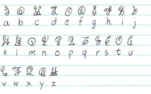
The Piparkaq Variant
So far, two variants have emerged from a discussion on the Madoka IRC channel. Please refer to the Talk:Handwritten runes page.
The Piparkaq Variant
- Features on optimizing shapes for block writing
- Borrows features from both archaic and modern rune sets for optimal handwriting
- Does not yet have numerals

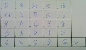
The Prima Variant
The Prima Variant
- Cursive style
- Best C-character for handwriting ♥
2ch Variant

2ch begun experimenting with handwritten runes after The Rebellion Story premiere. Despite the late start, their script quickly become quite polished in their own right.
Archaic
Modern
Numeric


Advantages:
- Clean
- Easy to learn
- Closely approximates the official font
Other variants
deviantART user JapanYoshi likened archaic runes to blackletter/fraktur writing and modern runes to serif, and attempted to make a "Sans Serif" variant. He only supplies a pixel art sample, but by far the most simplified variant for better or for worse.
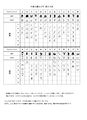
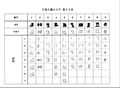
Charts
The Piparkaq Variant
| Alphabet | Stroke guide | Rune | Based on | Notes |
|---|---|---|---|---|
| A | 
|

|
||
| B | 
|

|
Based on Modern B, rather than the Archaic version, when concentrating on speed. This may clash with E and M. | |
| C | 
|

|
Borrowed from Prima's variant. | |
| D | 
|

|
||
| E | 
|

|
Based on the Archaic version of E. The crossing stroke is more distinct than with the modern version. | |
| F | 
|

|
||
| G | 
|

|
Tentative. The modern G rune feels more natural for handwriting, when compared to the inverse curl required in the archaic version. | |
| H | 
|

|
||
| I | 
|

|
Shape taken from modern I. Both modern and archaic share same features, modern is more fit for handwriting in this one. | |
| J | 
|
|||
| K | 
|

|
||
| L | 
|
|||
| M | 
|

|
||
| N | 
|

|
||
| O | 
|

|
||
| P | 
|

|
||
| Q | 
|

|
Tentative — one stroke drawing possible |